When I think about contemporary graphic design that feels both intelligent and emotionally aware, I often return to the work of Natasha Jen, partner at Pentagram. Jen was born in Taipei and built her career in New York, but what stands out most is not geography, it’s her mindset. She approaches design less as decoration and more as investigation. There’s a sense that each project begins with a question: What is this really about? What needs to be said? And just as importantly, what can be removed?
In a world saturated with fast visuals and instant opinions, her work feels deliberate, structured and considered. Whether she’s building a brand identity or shaping a visual system, there’s an underlying rigor, a belief that design should hold up under scrutiny. It should make sense intellectually, not just aesthetically. This has inspired me within my own projects, to encourage more in-depth research and demonstrate intention with every design element.
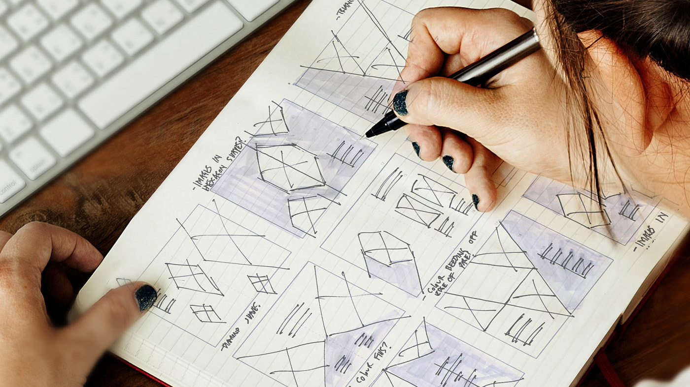
What I find most compelling is her openness about doubt. In talks and interviews, she challenges the myth that design is pure intuition or creative magic. Instead, she speaks about research, iteration, critique and about the uncomfortable but necessary work of thinking deeply. It’s a reminder that clarity doesn’t come from speed; it comes from patience and research.
One project that lingers in my mind is her identity for MIT Media Lab. At first glance, it feels systematic, a flexible logo built from a grid, capable of generating countless variations. However, the deeper I look, the more I see how much trust it places in structure and type. The typography doesn’t try to overpower the system. It works within it, supporting an identity that is both rational and expressive. What resonates with me is how this project treats typography not as a finishing touch, but as a framework for thinking. The grid becomes a language. The letterforms become participants in a larger logic. It’s restrained, yet expansive and controlled, yet open-ended; this demonstrates intention and rigorous research investigation.
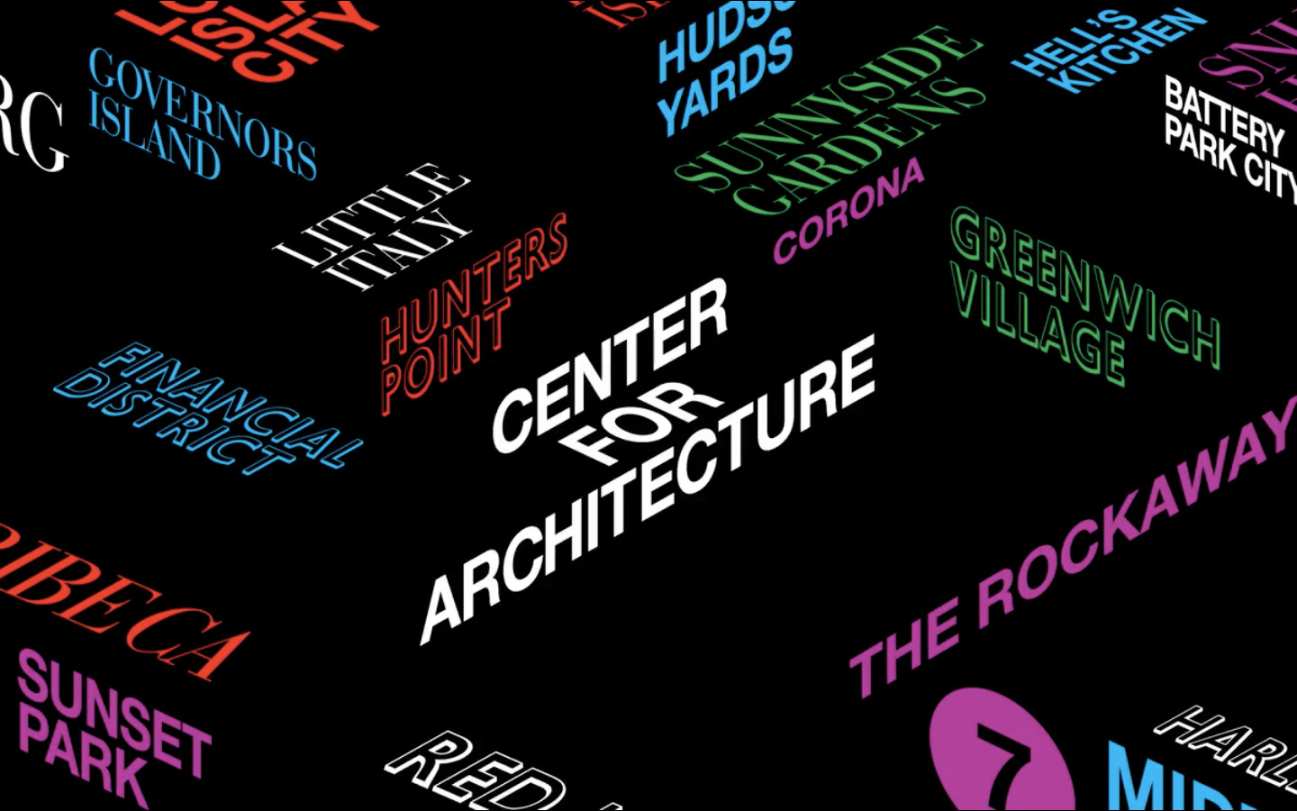
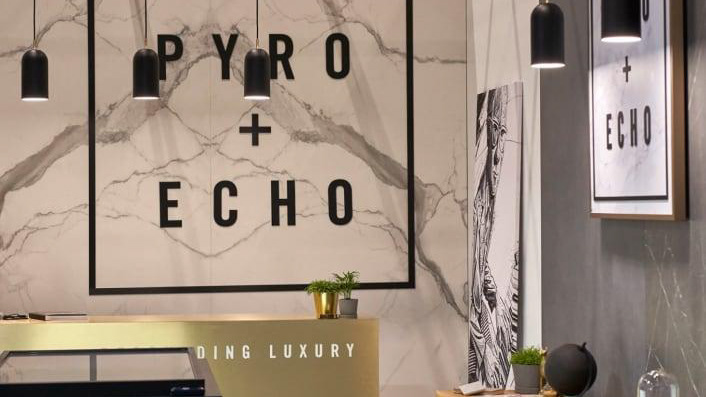
A good example is the AIA New York Chapter Welcome Desk for A’18, created for the 2018 Conference on Architecture. The installation used typography inspired by New York City’s Street signage. Different typefaces commonly seen around the city were combined and arranged at dynamic angles, referencing the visual energy and architecture of New York. Instead of creating a single custom font, the design relied on familiar typographic voices and brought them together in a bold but controlled way which worked in harmony with each other.