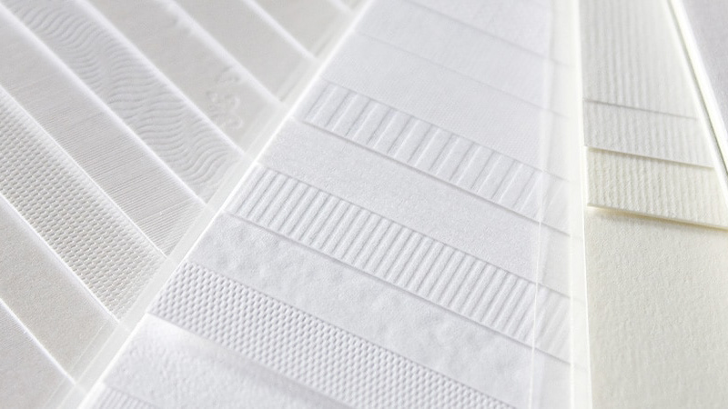
White space or negative space does not mean empty; it can be a powerful and active tool within design. It has psychological impact as it can shape how people feel. For example, white space can reduce cognitive load due to the brain constantly taking in information. When a layout is crowded, the brain works harder as more scanning is involved, and comprehension can tend to decrease. Therefore, white space can allow breathing room as it can separate the content into sections that is more digestible. This aids in hierarchy which helps the brain process information faster and more efficiently. This is why minimal layouts often feel easier and look more professional, as this strategy is based in cognitive psychology. When elements are grouped clearly, humans understand them better.
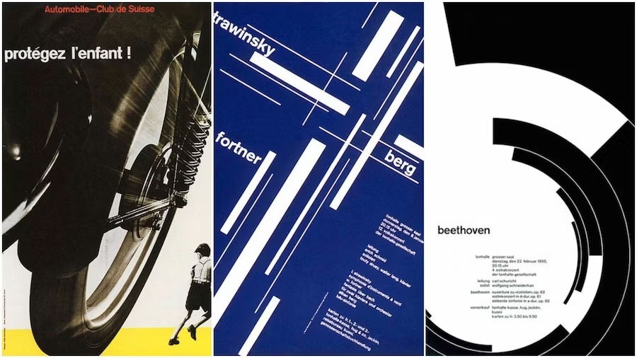
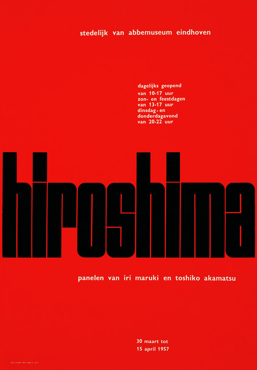
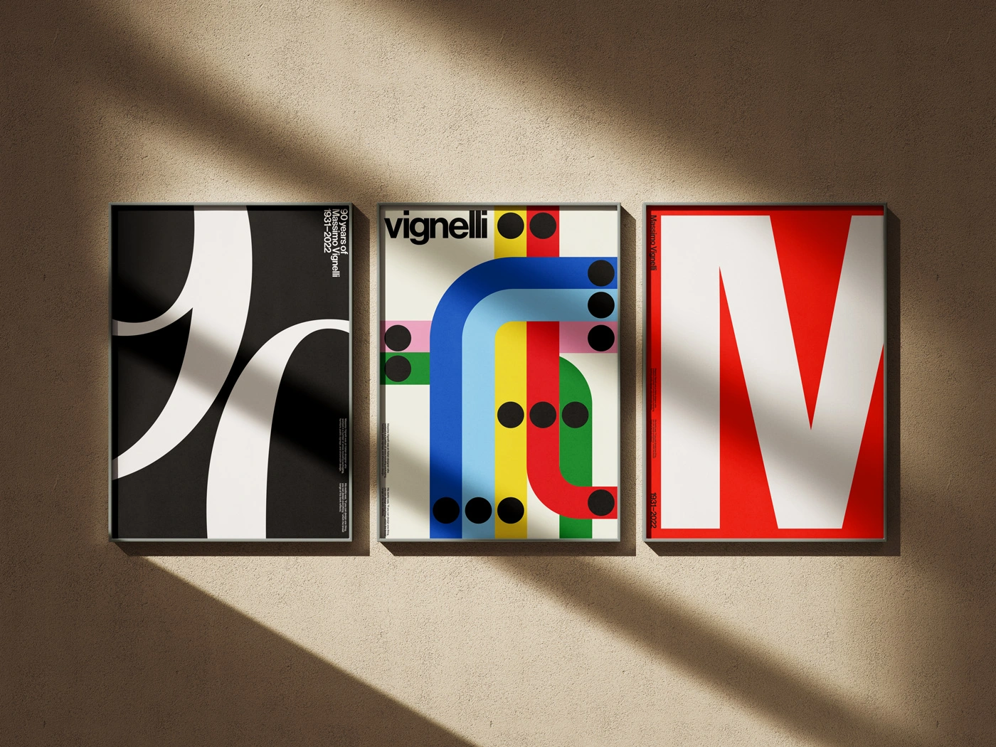
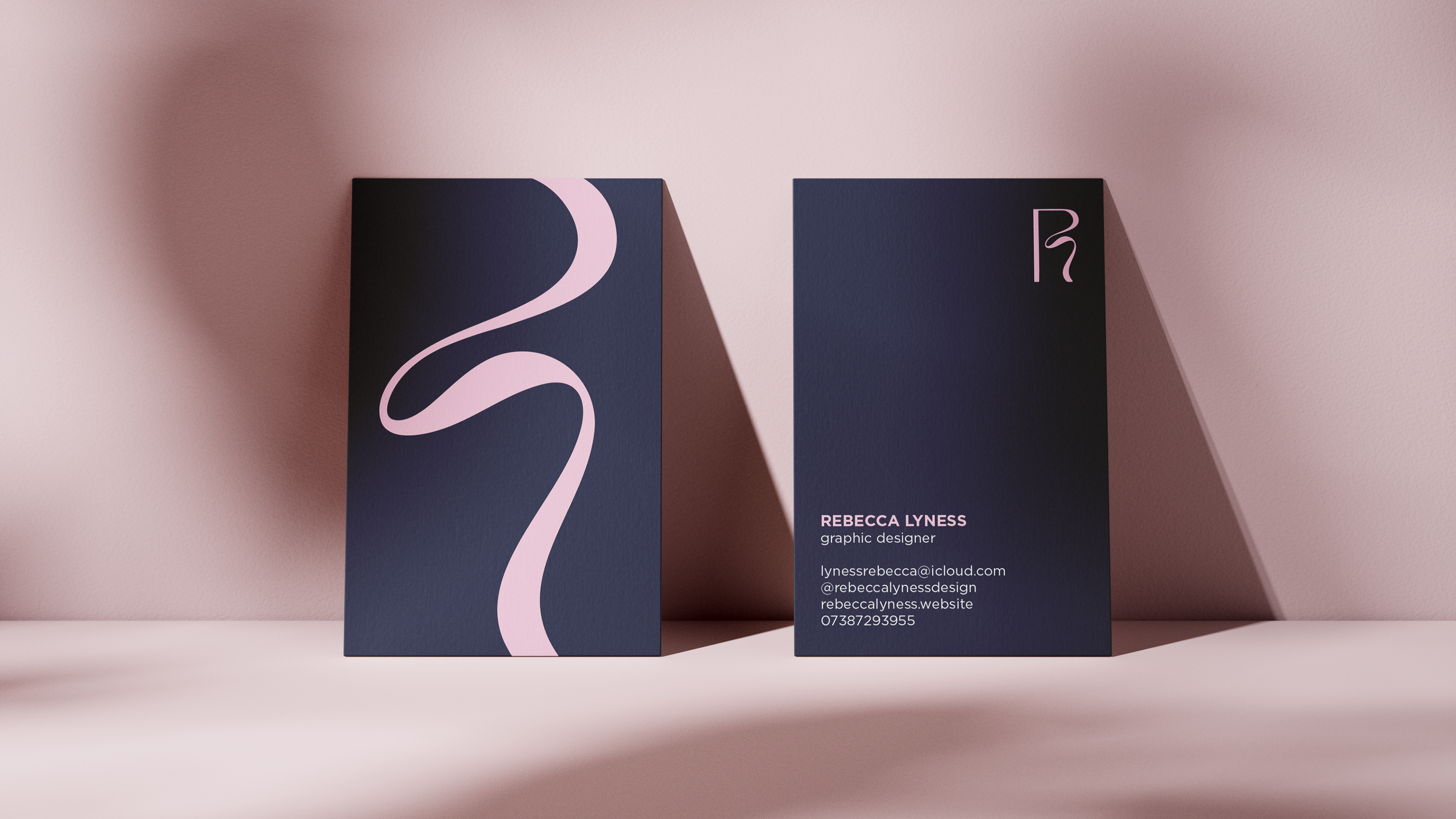
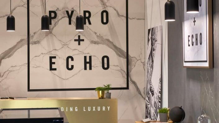
White space can also signal luxury and confidence, which can be seen in high end brands and editorial design. This is due to the fact that space often communicates control, restraint and authority. When a layout does not need to fight for attention, it indicates that the content does not need to shout. In compared to visually crowded designs, it often over stimulates and feels cheaper as this implies urgency or insecurity. Moreover, white space helps guide the eye as our eyes tend to gravitate towards contrast and density. When spacing becomes strategic, it helps lead the eye through reading material, emphasise important headlines and create a rhythm. Particularly in editorial design, the inclusion of margins, gutters and paragraph spacing almost choreographs how readers move across the page.
White space can also create emotional tone and change perceptions as dense layouts tend to be seen as energetic, chaotic, loud or urgent. However, spacious layouts are often perceived as calm, thoughtful and refined. Therefore, the amount of white space can impact and influence emotional responses. For example, a luxury skincare brand may use significant spacing to create tranquillity and exclusivity. White space has the power to adjust consumers’ moods without the need to alter any content. Similarly, space can also enhance what is important as isolation can indicate there is an emphasis somewhere. This is why pull quotes feel more powerful compared to body text and headlines feel more vital. Space can help frame text and logos as it can feel premium and more trustworthy as it signals to a structure. It exudes confidence and therefore is a mechanism to breathe and build hierarchy.