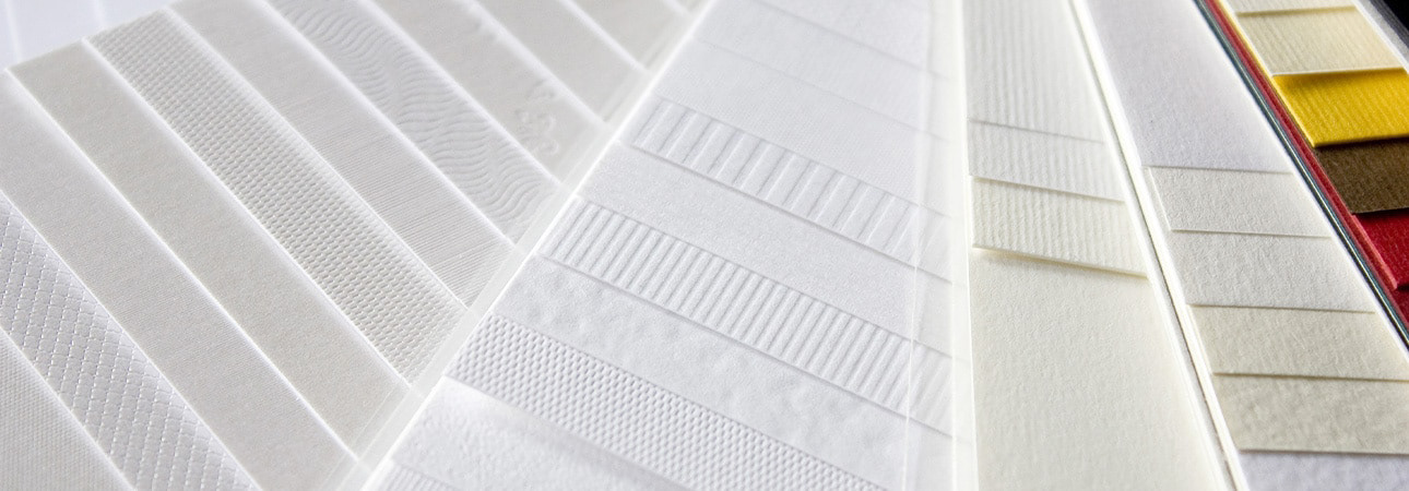
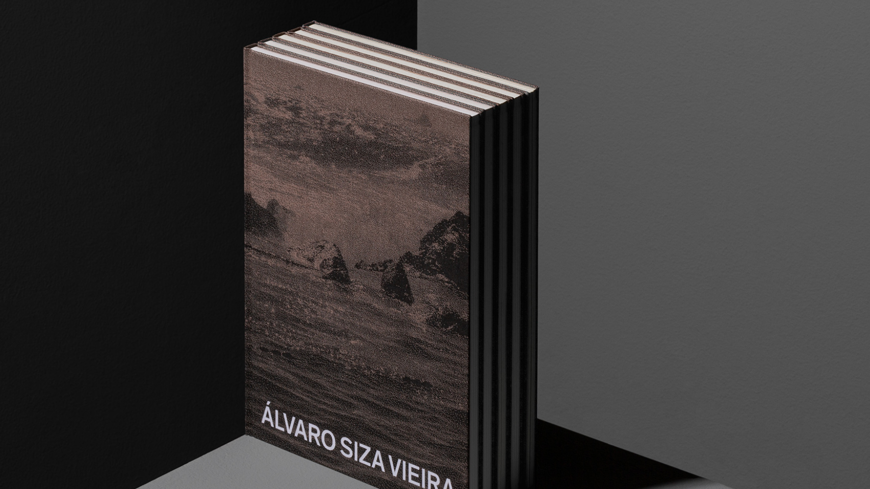
A reoccurring element of design that I had to consider frequently during my placement was how paper and materials impact how typography and ink is perceived. The texture of paper is significantly important as it allows for a connection off the screen through a tangible experience. A smooth and coated stock is often found in magazines, company documents and leaflets as this demonstrates an official and sophisticated tone. When this is paired with serif typefaces, it enhances detail and contrast.
However, on uncoated or textured stock, the type performs differently. The ink becomes more absorbent into the fibres which softens the edges and types like serifs, can appear more friendly and less clinical. The body text can also appear and feel more natural which encourages a slower and easier read, particularly if these are longer passages. For example, newspapers use absorbent paper which creates a familiar and more accessible reading texture. This type of paper connotes a more calm, thoughtful and editorial approach, whereas coated connotes a more polished, commercial and modern tone.
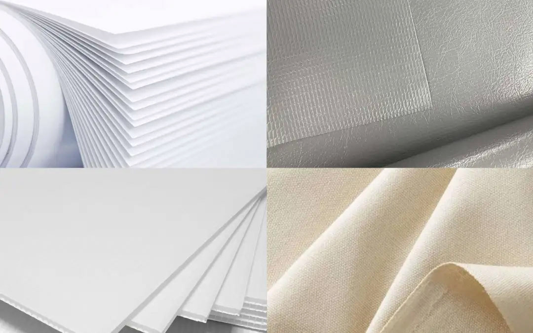
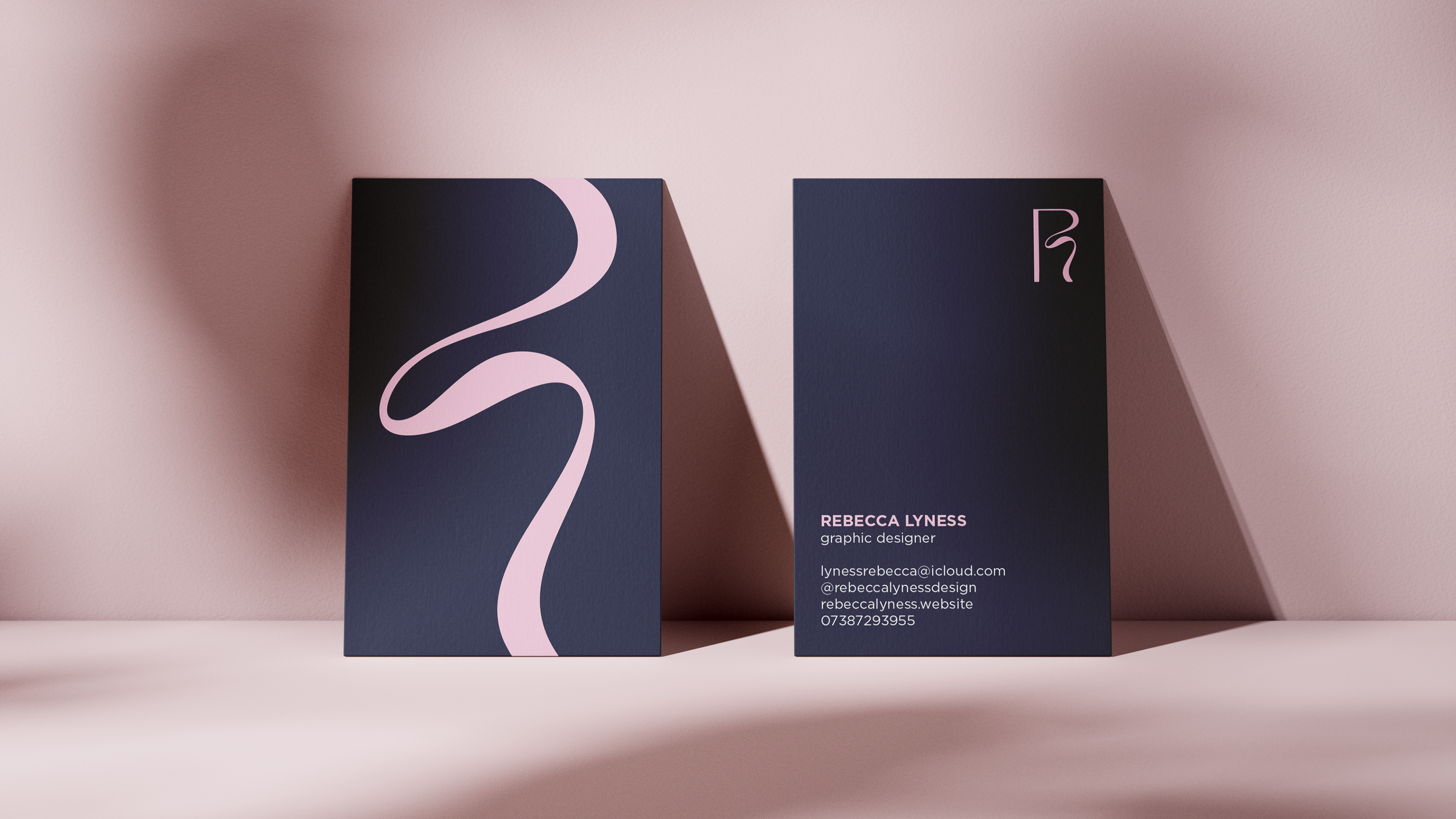
The paper weight is another element within print to consider as this affects how typography functions not only aesthetically but practically. The paper weight can change perception as a heavier stock feels more permanent and valuable. For example, when minimal typography is printed on thicker paper, it can feel more intentional and premium even if the layout is simplistic. Heavier stock can also change how typography behaves as larger type can feel more stable and grounded as the material supports the visual weight of the letters. However, lightweight paper feels temporary which can be seen in newspapers and leaflets. The typography may be the same with both stocks, but the message will feel different as these weights demonstrate different purposes. On thinner stock, heavy ink coverage can cause slight warping which affects precision. Therefore, the material dictates whether the design can handle strong contrast or larger blocks of text.
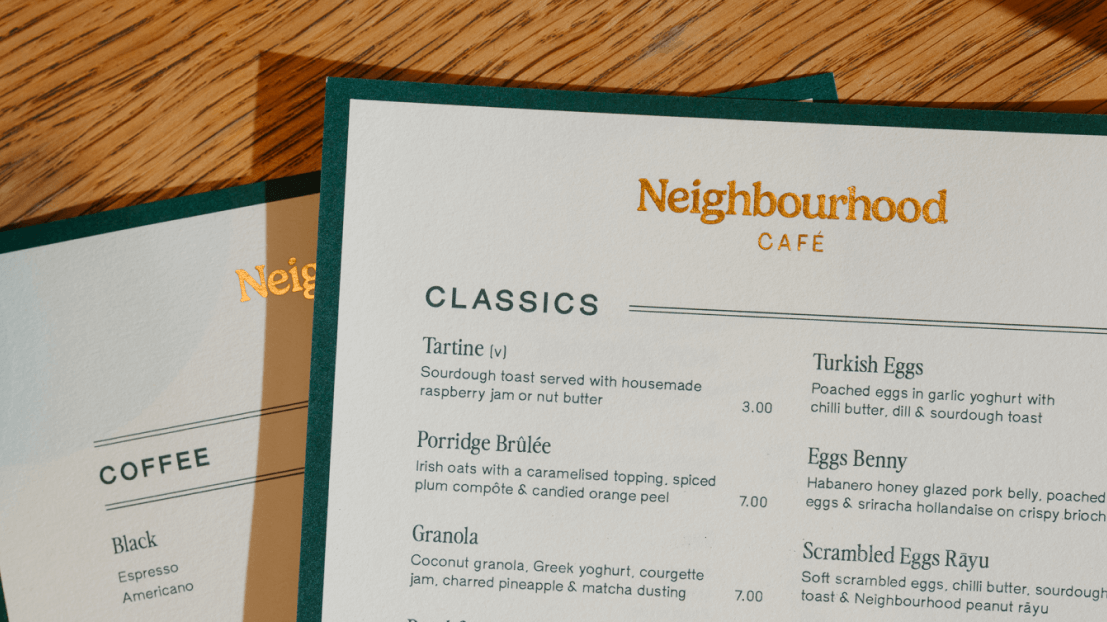
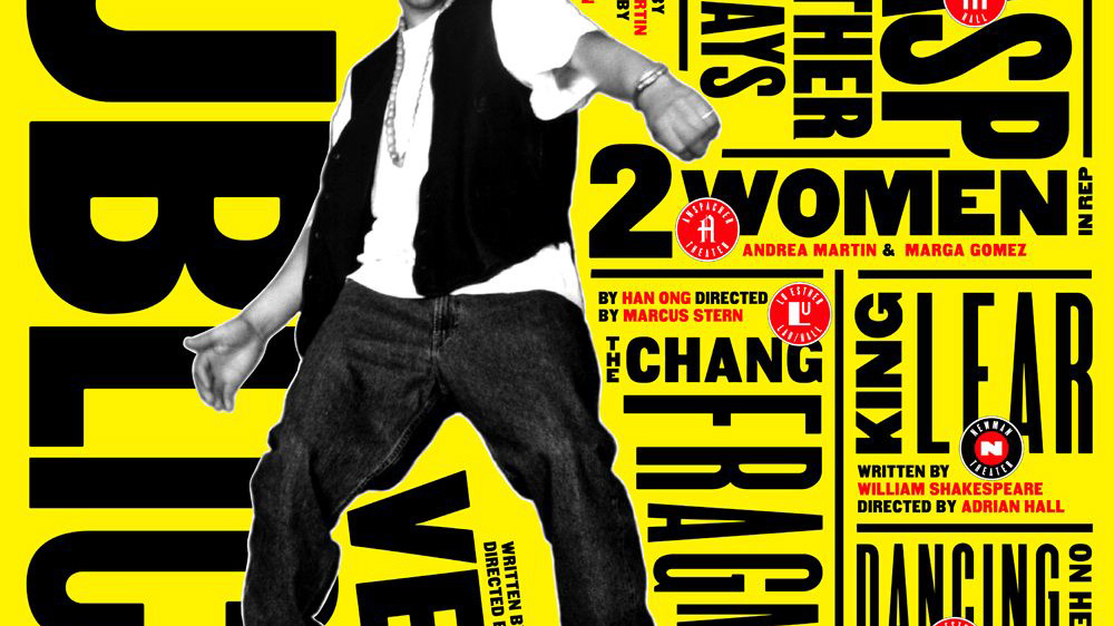
Further, ink and colour are other significant elements to consider as these appear different on screen to print. Ink absorbs and interacts on the material whereas it sits on the screen. One of the first things I’ve noticed is that paper tone changes everything. Paper is rarely a pure, clinical white. It can be warm, cool, cream, grey, or recycled with visible fibres. When black ink is printed on bright white stock, the contrast feels sharp and modern. The typography looks clean and defined, but in comparison to black on cream paper, it immediately feels softer and more traditional. On coated paper, ink sits more on the surface and colours appear vibrant and saturated. The edges are crisp which makes this ideal for bold typographic posters or high-contrast editorial spreads where precision matters. However, on uncoated paper the ink sinks slightly into the fibres, where the colours appear duller and more muted, and edges soften. What I find most interesting is how colour in print feels more permanent. On screen, colours are backlit and temporary but in print, they’re embedded into a surface. They exist physically and that permanence changes how typography is experienced.
Overall, I’m starting to understand that typography in print isn’t just about selecting fonts. It’s about anticipating how material will affect those typographic, layout and hierarchy choices. In that sense, typography doesn’t exist on its own as it responds to its material.