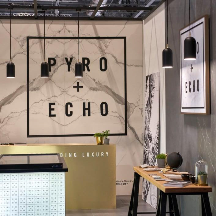
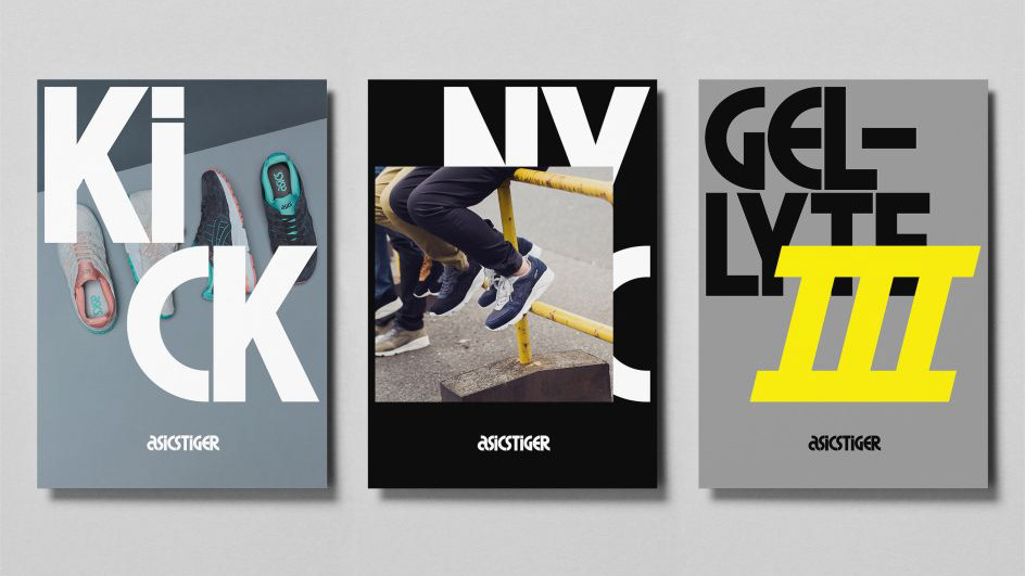
Part Two Design is an independent design studio based in Belfast. A range of their projects focus on branding, editorial design, and printed materials, which makes typography a central part of their work. What stands out to me about their strategy driven concepts which communicate a strong purpose and clarity to their clients. Their innovative strategy and design outcomes allow for their brands to form connections and long-term relationships with clients and their audience.
Another element I found interesting is how their work often relies on strong grid structures. This creates a sense of balance and order, especially in editorial layouts. It shows how typography can organise information clearly while still feeling visually engaging. In print design particularly, grids help guide the reader’s eye and make large amounts of text easier to navigate. Part Two Design also show that typography doesn’t always need to be expressive or experimental to be effective. Sometimes the strength of the design comes from restraint, careful alignment, thoughtful spacing, and clear typographic hierarchy. These details might seem small, but together they create work that feels considered and professional.
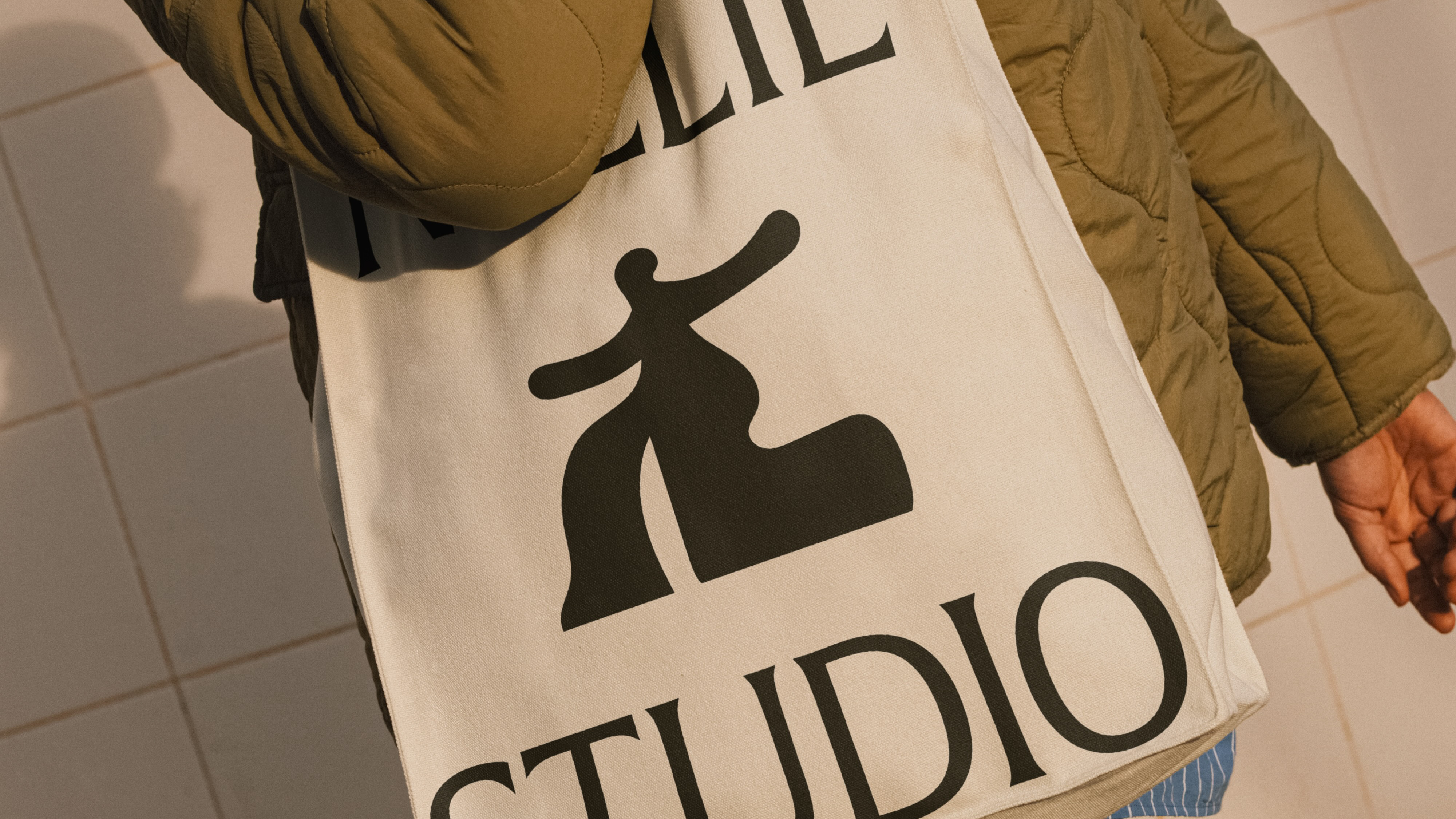
An example of this approach is their work for “Imogen”, where the typography carries the overall identity. Instead of relying on complex graphics or imagery, the design focuses on type as the main visual element. The typography feels quite refined and minimal. The letterforms are clean and balanced, which gives the brand a calm and considered tone. This kind of restraint seems intentional. By keeping the design simple, the type has more space to stand out, and the overall identity feels more sophisticated. What I find interesting about the “Imogen” project is that it demonstrates how a brand can be built almost entirely through typography. The style of the type communicates the brand’s personality; subtle, elegant, and modern, without needing a lot of additional visual elements.